TechnologyFormats
Portrait screens: why landscape content does not fit
A rotated screen shows a landscape video on barely a third of its area. How content for portrait is made and how mistakes show up early.
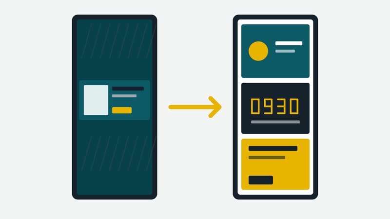
Portrait orientation is common in everyday use: menu boards on the wall, kiosks in entrance areas, displays next to the lift, narrow shop-window screens. The devices are built for it or get rotated. The content, by contrast, often still arrives as a landscape video from the agency. The result on the screen is a small, sharp strip of picture between two black areas.
A calculation to begin with
A Full HD screen in landscape has 1920 × 1080 pixels. Rotated, it is 1080 × 1920. A 16:9 video is fitted to the width of the rotated screen: 1080 pixels wide, 607.5 pixels high. That is about 31.6 per cent of the screen height; the rest stays empty. What was meant as a film for the whole screen uses less than a third of it, and text that was legible in the original shrinks along with it.
The alternative, enlarging the video until it fills the height, cuts off more than two thirds of the picture on the left and right. Neither route is good. Portrait therefore needs content of its own.
Three rules for portrait content
1. Compose anew instead of rotating. Landscape content is not tipped by 90 degrees but rebuilt for the height. Portrait offers room to stack: a picture or video at the top, the message in the middle, a price or note at the bottom. Thinking this way uses the area rather than merely filling it.
2. Keep the edges free. Frames, housings and wall mounts cover an edge, depending on the device. Important text and prices therefore do not belong on the outermost edge. An even safety margin on all sides is cheaper than a screen that shows "euro" only half.
3. Fewer words, larger type. Portrait has less width per line. Long words wrap early, and running text quickly looks like a wall on a narrow area. Short lines in large type with enough line spacing stay readable from a distance.
Rotating the device or rotating the content
Depending on the device there are two ways. Either the screen is rotated mechanically and the software rotates the output image with it, or the content is already in portrait and the device stays in its default position. Which way is possible is stated in the manual of the device and the player software. For the editorial side one thing matters most: it has to know in which resolution the content finally arrives, because the design follows from that. Whoever does not clarify this ends up with content that is either blurred or cropped.
Mixed fleets
If an organisation runs landscape and portrait side by side, the content should carry its format in the file name or folder, such as "landscape" and "portrait". A playlist for portrait screens must not contain landscape files. That sounds obvious and is nevertheless the most common mistake as soon as several people upload content. Systems that filter images by aspect ratio help with this; without such a filter, a clear folder structure does.
Zones in portrait
Portrait suits several areas stacked on top of each other. The video runs at the top, below it a line with date and time, at the very bottom a ticker or a notice. Each area has its own editor and its own rhythm as long as the number of zones stays small. With more than three areas stacked, each zone becomes so narrow that nothing is legible.
Checking before roll-out
Portrait content is checked on the target device, not at the desk. Three questions are enough:
- Is everything legible when standing three to four metres away?
- Is anything placed in the edge area that the frame covers?
- Does the change from one item to the next run without a black frame?
A photo of the screen at the site, laid next to the design template, helps. It shows in seconds where margin, contrast or type size are wrong. The effort for this step is small compared with a campaign that is only noticed after launch.
Conclusion
Portrait requires no special technology but a design of its own. Whoever uses the area instead of giving it away gets more impact from the same screen. This magazine is published by Kapaso GmbH; the article describes general practice and refers to no product.